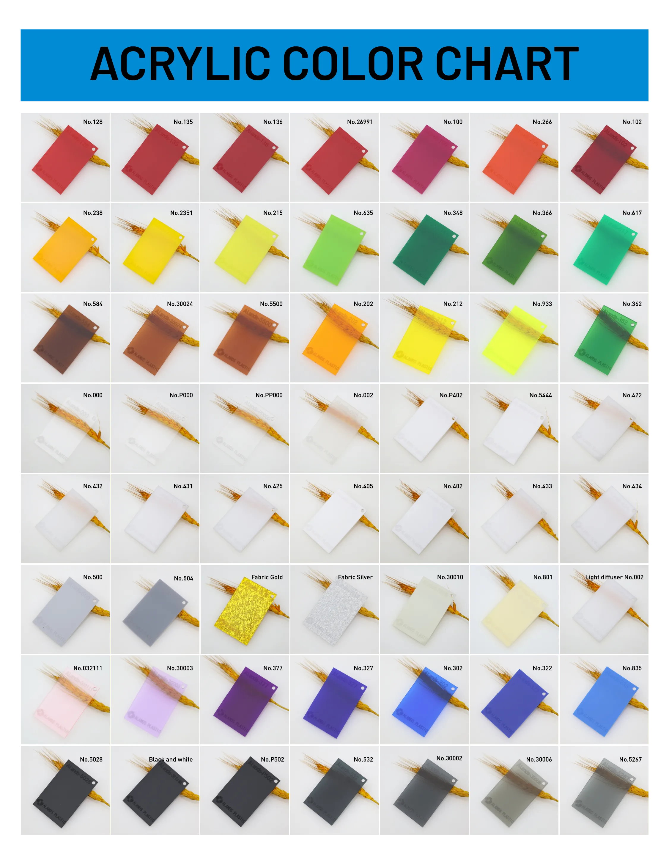
Acrylic Color Chart: Helping Customers Make Fast, Accurate Decisions
In advertising, exhibition, interior decoration, furniture, and crafts, acrylic sheets are widely used for their rich colors, diverse light transmission, and varied surface textures.
Yet customers often face three key challenges when choosing materials:
Digital photos or online samples don’t show true colors, translucency, or textures;
Similar colors make it hard to pick the right option;
Orders may lead to color differences, returns, or rework.
An Acrylic Color Chart is the efficient tool to solve these problems.
1. Real Material, Real Color – See Differences at a Glance
This chart shows the actual standard color numbers available from the manufacturer:
Red & Orange Series: No.128, No.135, No.136 up to No.266, No.102 – from deep reds to bright oranges, ideal for eye-catching signage and display stands;
Yellow Series: No.238, No.2351, No.202, No.212, No.933 – bright or fluorescent, great for warning signs or trendy décor;
Green Series: No.215, No.435, No.348, No.346, No.417 – from light to dark, perfect for eco-themed or interior partition designs;
Neutrals & Special Effects: No.500, No.504 grays, No.000 and No.432 clear/opal white, Fabric Gold and Fabric Silver with metallic fabric textures – ideal for premium décor, trophies, or gifts;
Blue & Purple Series: No.377, No.327, No.302, No.322, No.835 – from deep purple to bright blue, suited for technology, education, or exhibitions;
Black/White/Gray Series: Black and White, No.P502, No.30002, No.30006, No.5267 – dark gray, solid black, or semi-transparent grays for modern minimalist styles.
Customers can see the true look of each color under natural light instead of guessing from screens.

2. Quick Color Comparison – Save Time in Material Selection
With the color chart, customers can:
Compare similar shades side by side (like No.348 vs. No.346 greens);
Check different light transmission (No.000 clear vs. No.405 opal vs. Fabric Silver semi-transparent metallic);
Lock in the best option within minutes without repeated sample requests.
3. Clear Standards – Reduce Procurement Risks
Each color on the chart has a fixed code (e.g., No.327, No.933).
Customers simply note the color code when ordering, and the supplier produces according to the chart standard, reducing color differences, returns, and rework for peace of mind.
4. Spark Design Creativity
Beyond basic colors, the chart also shows:
Fluorescent Series (No.212, No.933) for bold trendy accents or warning signs;
Gold & Silver Fabric Texture (Fabric Gold, Fabric Silver) for premium plaques, souvenirs, or backdrops;
Semi-transparent Gray/Black Series (No.30002, No.30006, No.5267) for industrial or high-tech aesthetics.
These special effects help designers and customers instantly see how materials will look in real life and inspire more creative solutions.
Conclusion
This Acrylic Color Chart is like a “real-life catalog”:
Real: Real material, real color, real texture;
Efficient: Compare, choose, and order all in one step;
Reliable: Standardized color codes reduce risks;
Inspiring: More colors and finishes spark new ideas.
For customers, a single color chart is a decision-making tool—see it first, choose it right, order with confidence.
To discover more color options and full product details, contact the official alands brand.
